
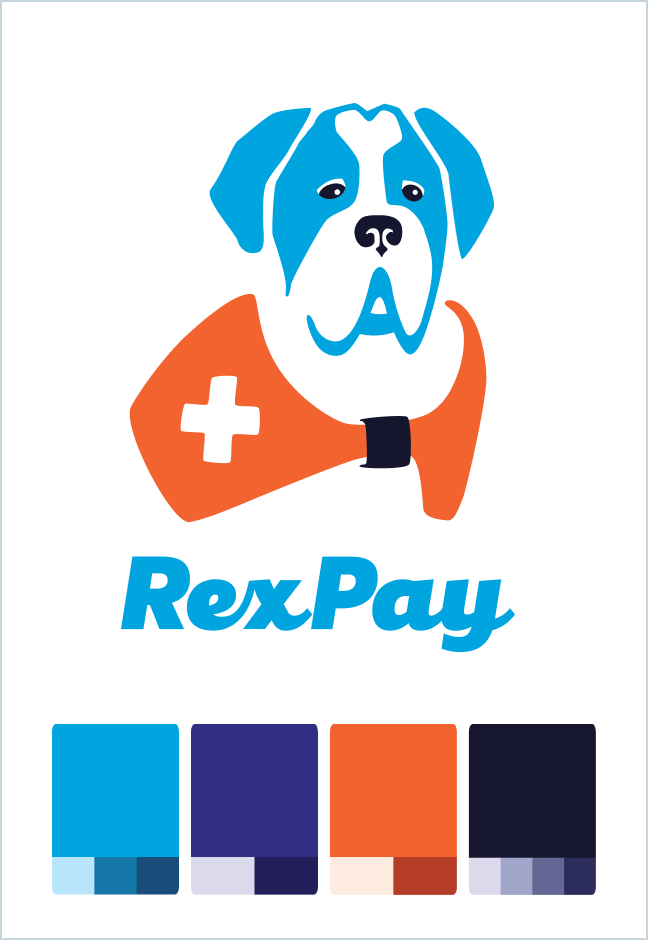
The B2C healthcare fintech startup RexPay was pivoting to B2B and needed a complete rebrand for its new life as Rivia Health.
I created the Rivia Health brand in its entirety, rebranded a whole slew of existing sales and marketing assets, and assembled detailed guides for the Engineering team to implement the rebrand throughout Rivia Health’s suite of products. I also wrote this blog for Rivia Health, capturing the rebrand as a change stemming from growth and expansion.
Highlights!
The Logo
The logo encapsulates Rivia Health’s brand values of empowerment, empathy, ease, efficiency, and clarity. The logomark is a hand held out in service to empower and come alongside patients and providers with empathy. It’s shaped into circle-based forms (as circles are clear, easeful, and efficient). This logomark encapsulates a brand that empowers full-circle, empathetic industry transformation.
The logotype is created from a typeface that has easeful extensions that reach out to connect through empathy and empowerment. Even the letter i looks like a person reaching out, standing at the ready to offer service.
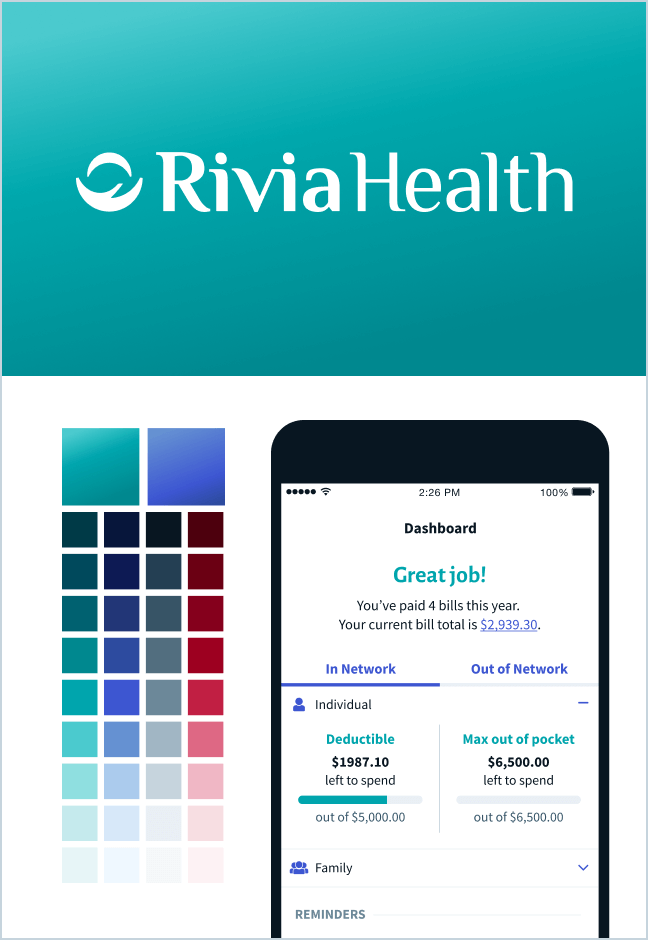
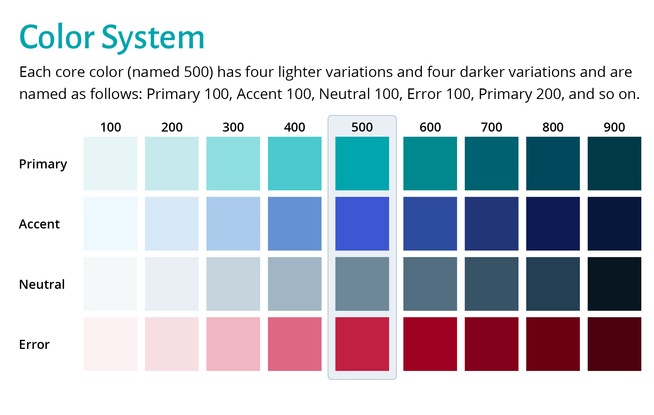
The Rivia Health Color System

The rebrand of their consumer-facing app needed to have the capability of being white-labeled to easily fit into the brand ecosystem of future enterprise clients. I designed their main color system with this requirement at the forefront.
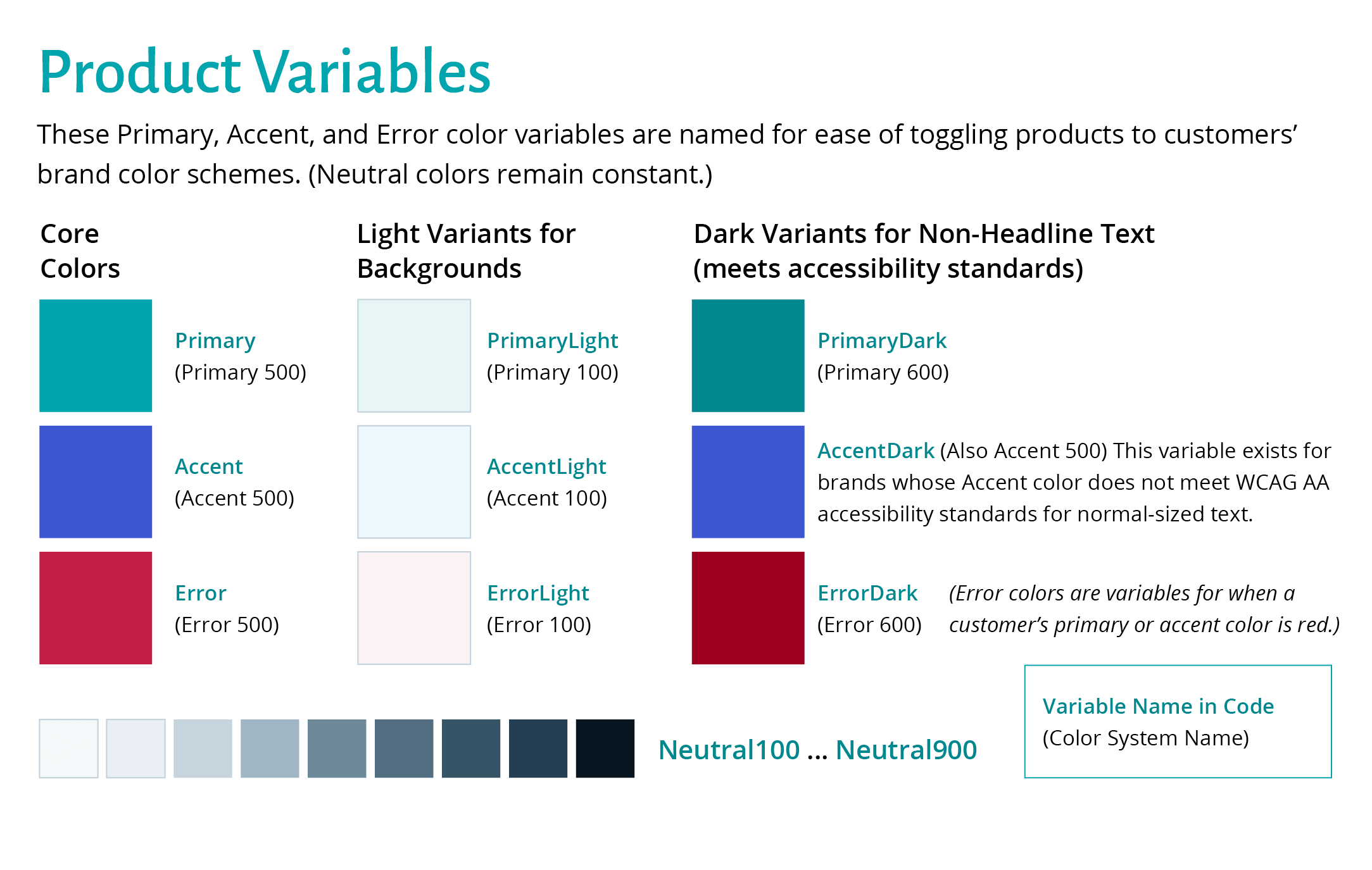 Product color variables took accessibility standards into consideration, not just for Rivia Health’s brand colors, but for the unknown colors of future enterprise clients as well. Specifically, even though Rivia Health’s Accent color met WCAG AA accessibility standards, I specified an AccentDark variable within the app rebrand guidelines to take into account enterprise clients whose Accent color is not accessible. In addition, I created Error variable in case a future enterprise client’s primary or accent color is red.
Designing Through Ambiguity
While I always strive for clarity, changes mid-project are inevitable in the world of a fast-paced startup. In the case of the rebrand from RexPay to Rivia Health, the name of the company shifted multiple times while I was designing the logo! I designed the logomark while the company was to remain named RexPay, then the decision was made to change the name to Rivia. One I finalized the Riva logo (both the logomark and wordmark), the name was changed to Rivia Health. The ability to maintain focus while having flexibility was a strength I used frequently during this rebrand.
Want more?
Click to view the Rivia Health Brand Style Guide (which I also wrote and designed) in its entirety!
Creative Director: Me!


