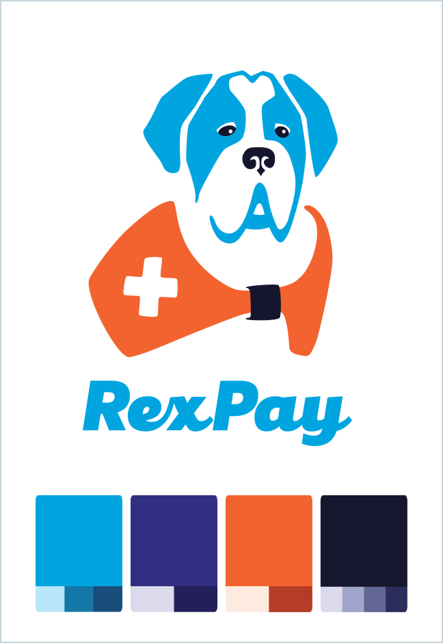
The RexPay logo combines reliability and friendliness. The rescue dog logomark is a strong, reliable Saint Bernard who is on your side to help you whenever you’re in need. The RexPay logotype reflects the friendliness of the RexPay brand with forward-moving connected letters that have a subtle nod to friendly dog tails!
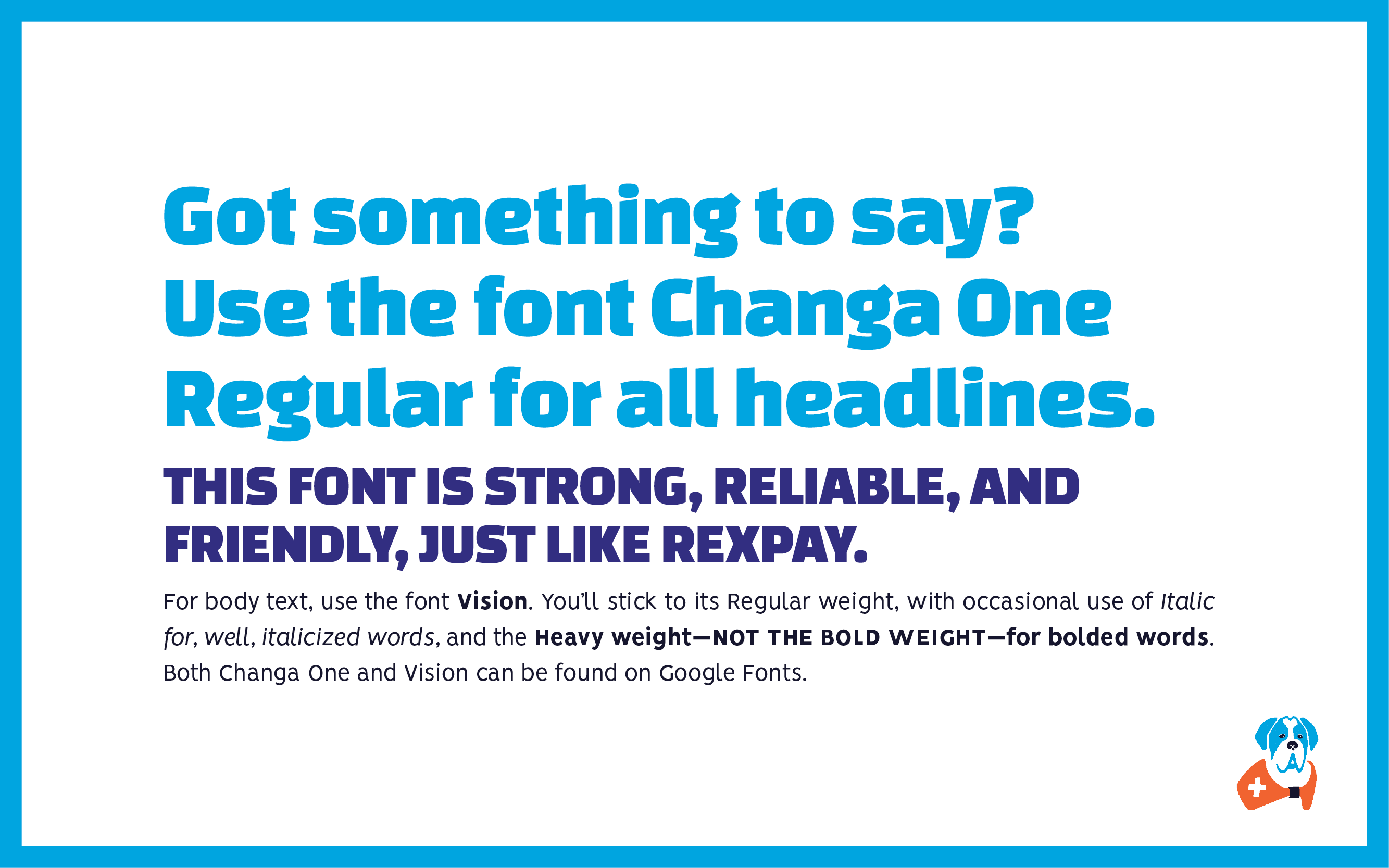
RexPay’s typography continued the brand’s values of being strong, reliable, and friendly.
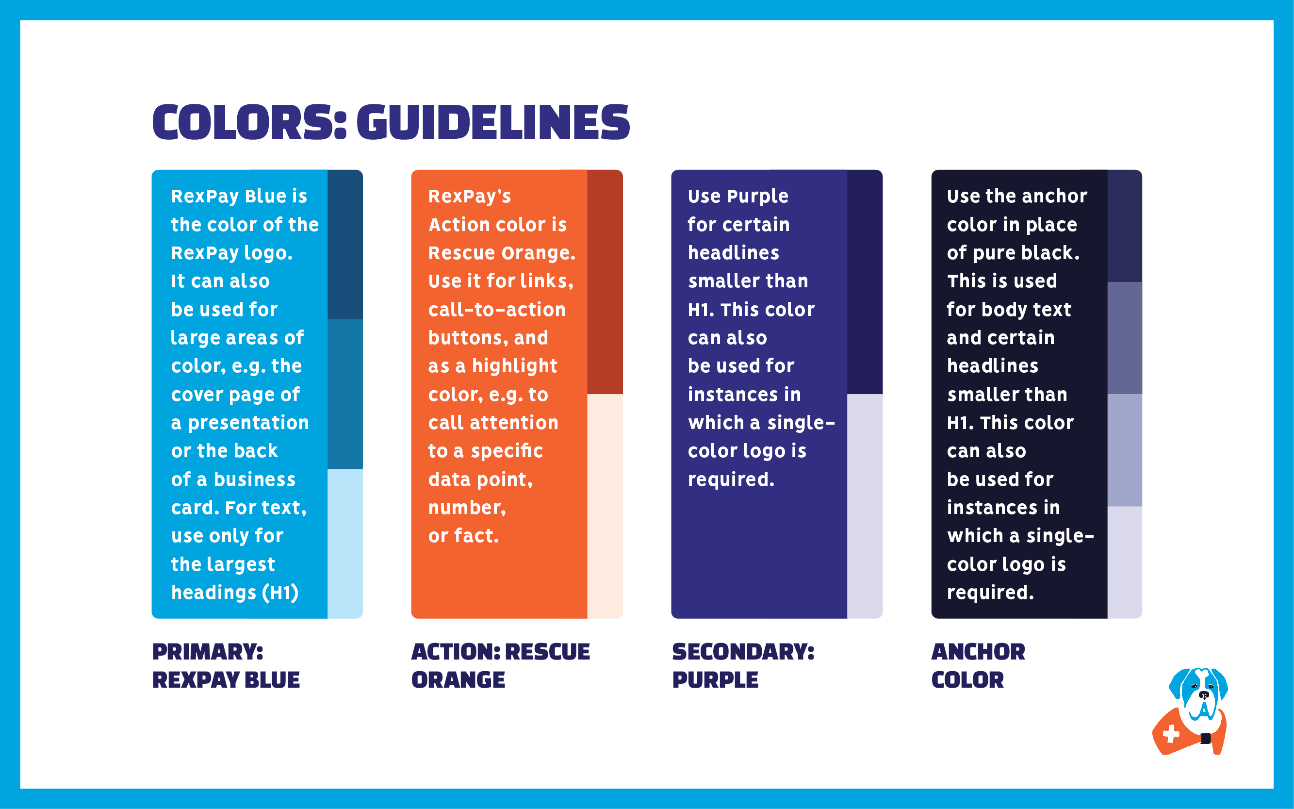
RexPay’s primary color is blue, as it is still a healthcare brand after all, but a punch of orange and purple create a strong playful presence.
RexPay aims to disrupt the world of healthcare through a friendly and playful patient-focused app. Medical billing can be a stressful and healthcare is dominated by brands that are restrained and serious. I created RexPay’s visual identity to have a strong personality-filled presence to stand out in the market and to offer patients a dose of delight to bring some joy into the joyless process of managing medical bills.
![]()
The RexPay logo combines reliability and friendliness. The rescue dog logomark is a strong, reliable Saint Bernard who is on your side to help you whenever you’re in need. The RexPay logotype reflects the friendliness of the RexPay brand with forward-moving connected letters that have a subtle nod to friendly dog tails!
RexPay’s typography continued the brand’s values of being strong, reliable, and friendly.
RexPay’s primary color is blue, as it is still a healthcare brand after all, but a punch of orange and purple create a strong playful presence.